Graphic Design Portfolio
2026
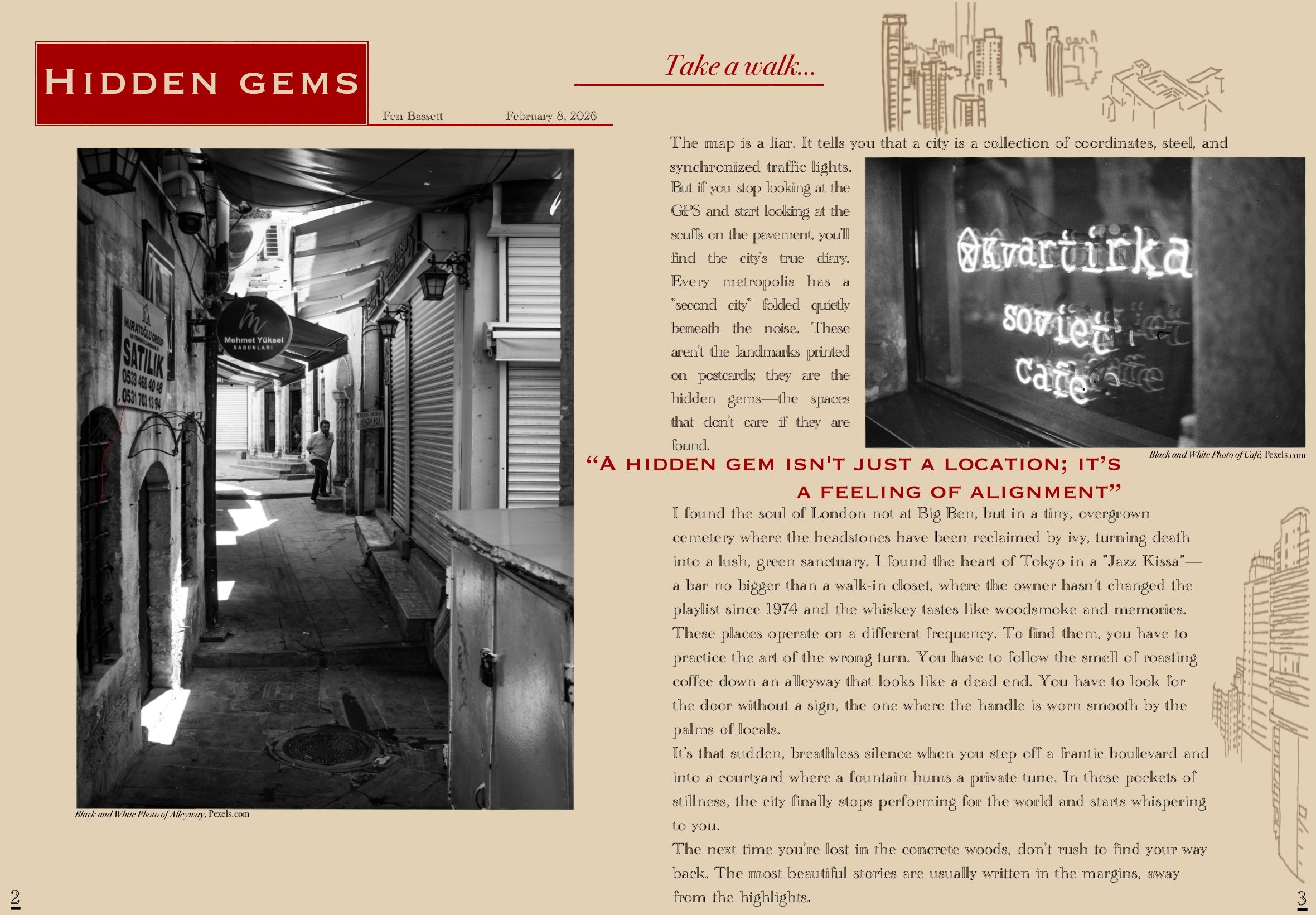
Magazine Spread
This magazine spread was made using royalty-free images and showcases a classic and sleek article style design. The color palette is purposefully limited to maintain a stoic tone.

Logo Design
My logo design incorporates lots of personality based on the subject matter. I include bold color contrast in order to display the brand effectively. My compositions often have a lot of movement and fluidity between graphic elements, text and imagery.
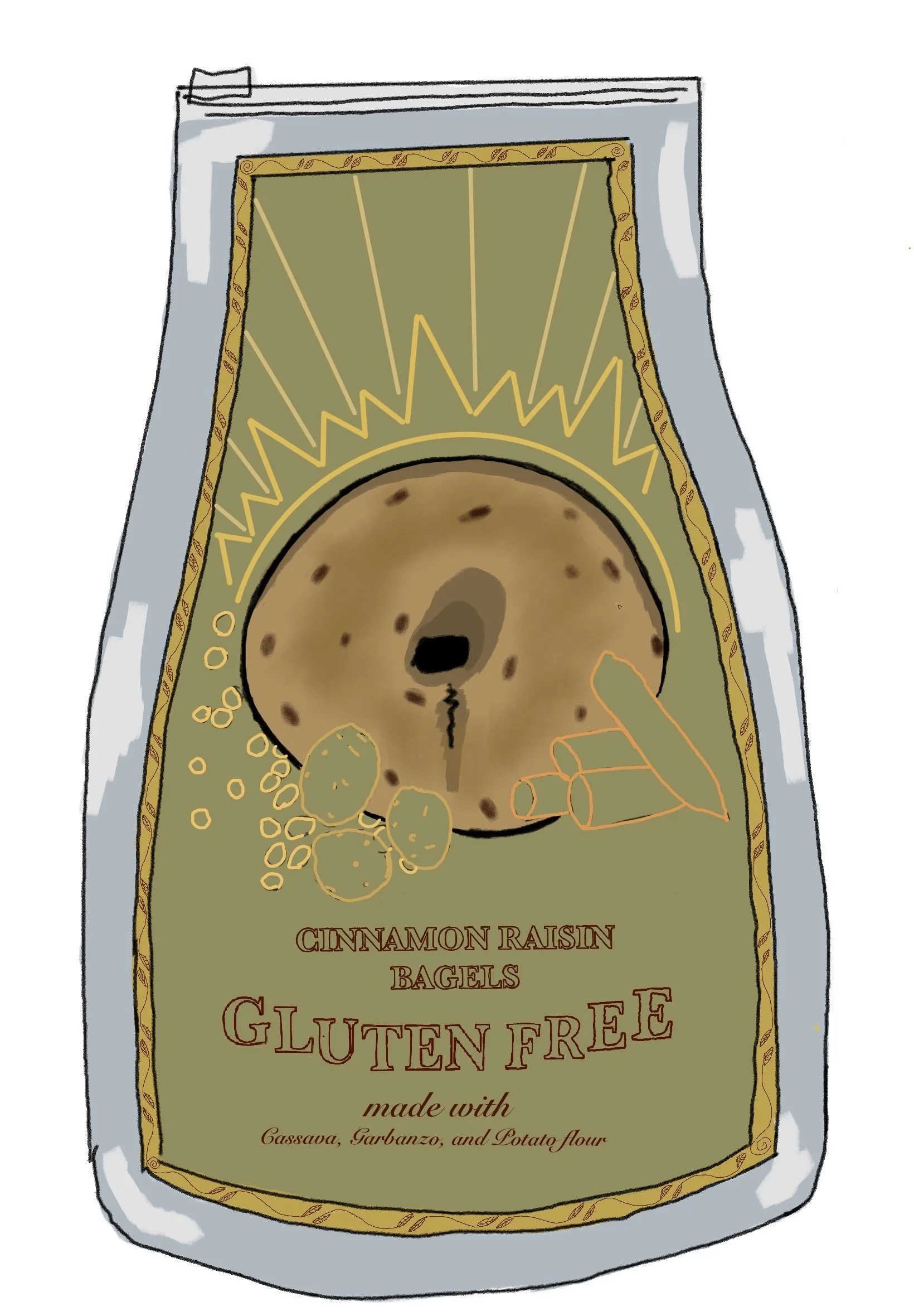
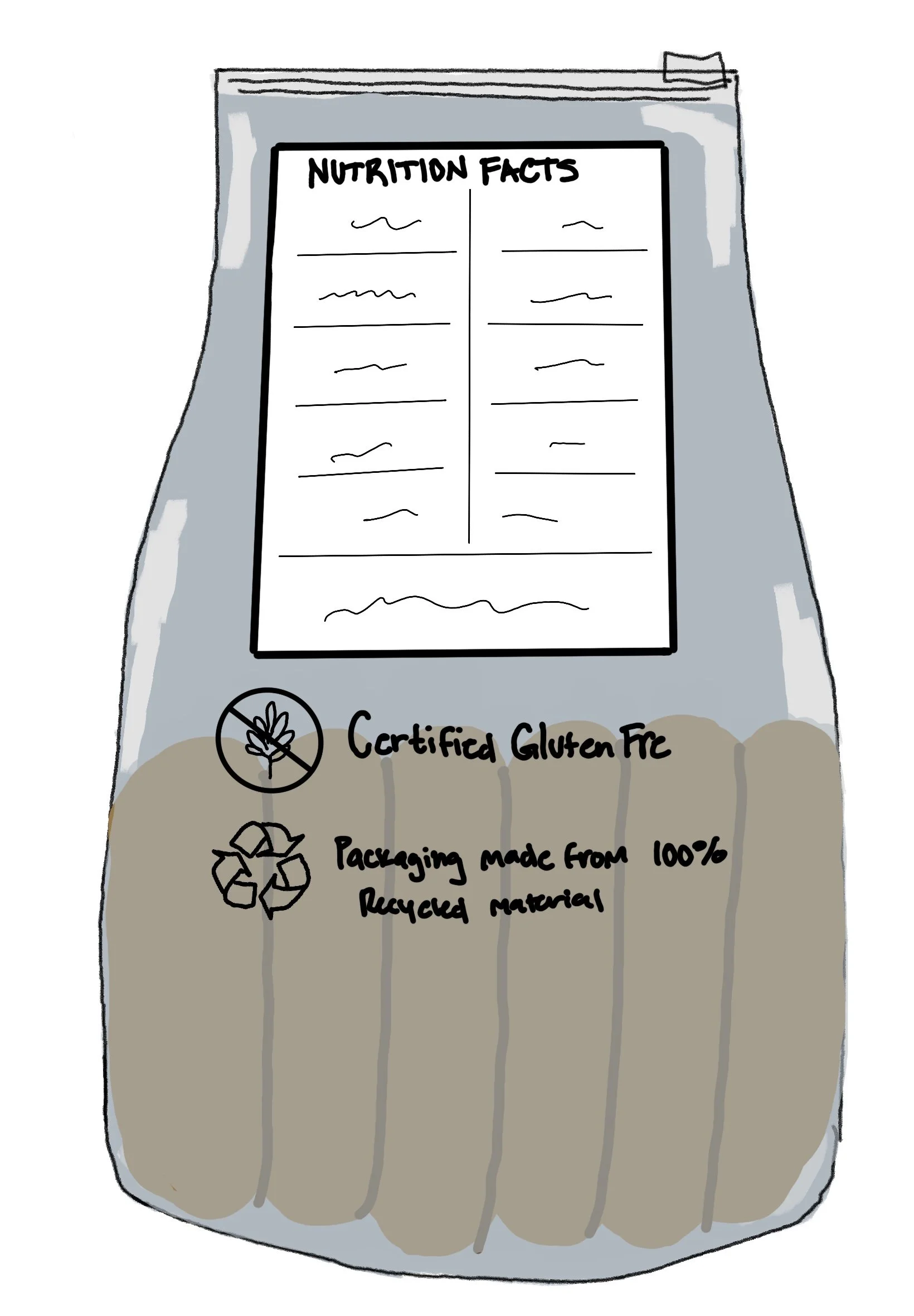
Packaging Design
This package design was born out of need. As someone who is gluten free, I wanted to design a product that would suit those needs. The packaging showcases the gluten free label boldly to grab attention. The color palette features earth tones to compliment the organic ingredients.
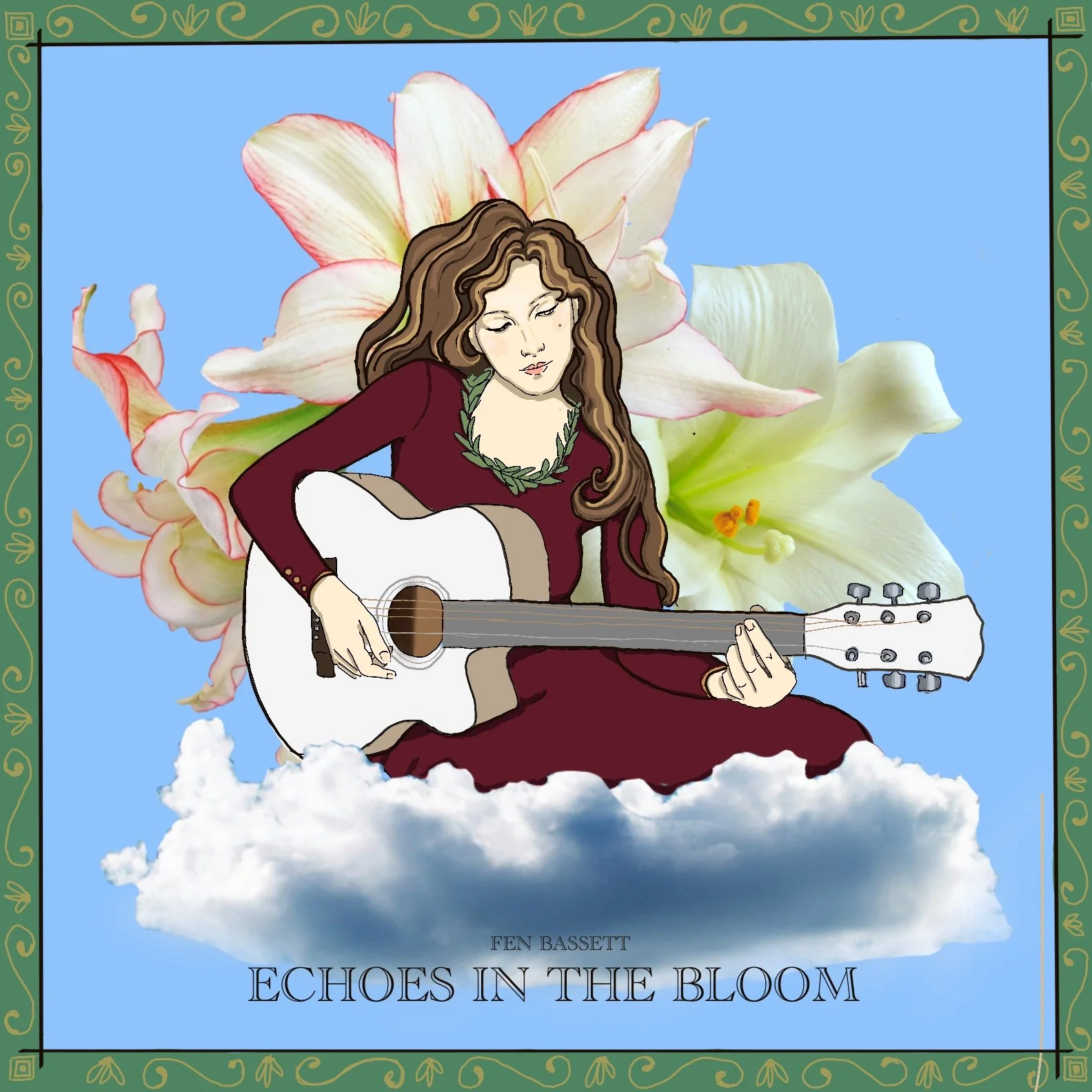
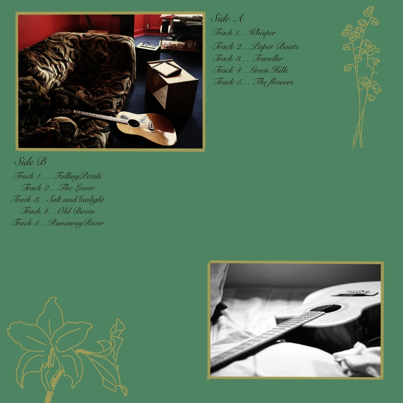
Album Cover
This album cover was made using images and illustrations. This is a folk album, so I chose whimsical imagery and light summery tones. My font is a mixture of stylish and vintage.
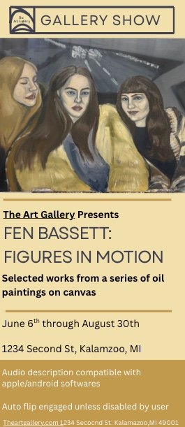
Digital Brochure
With this brochure I explored accessibility guidelines for the first time. The composition is designed for readability and legibility, and the original has built-in audio. The color palette mirrors the art featured on the brochure, and the font is meant to be bold and legible.
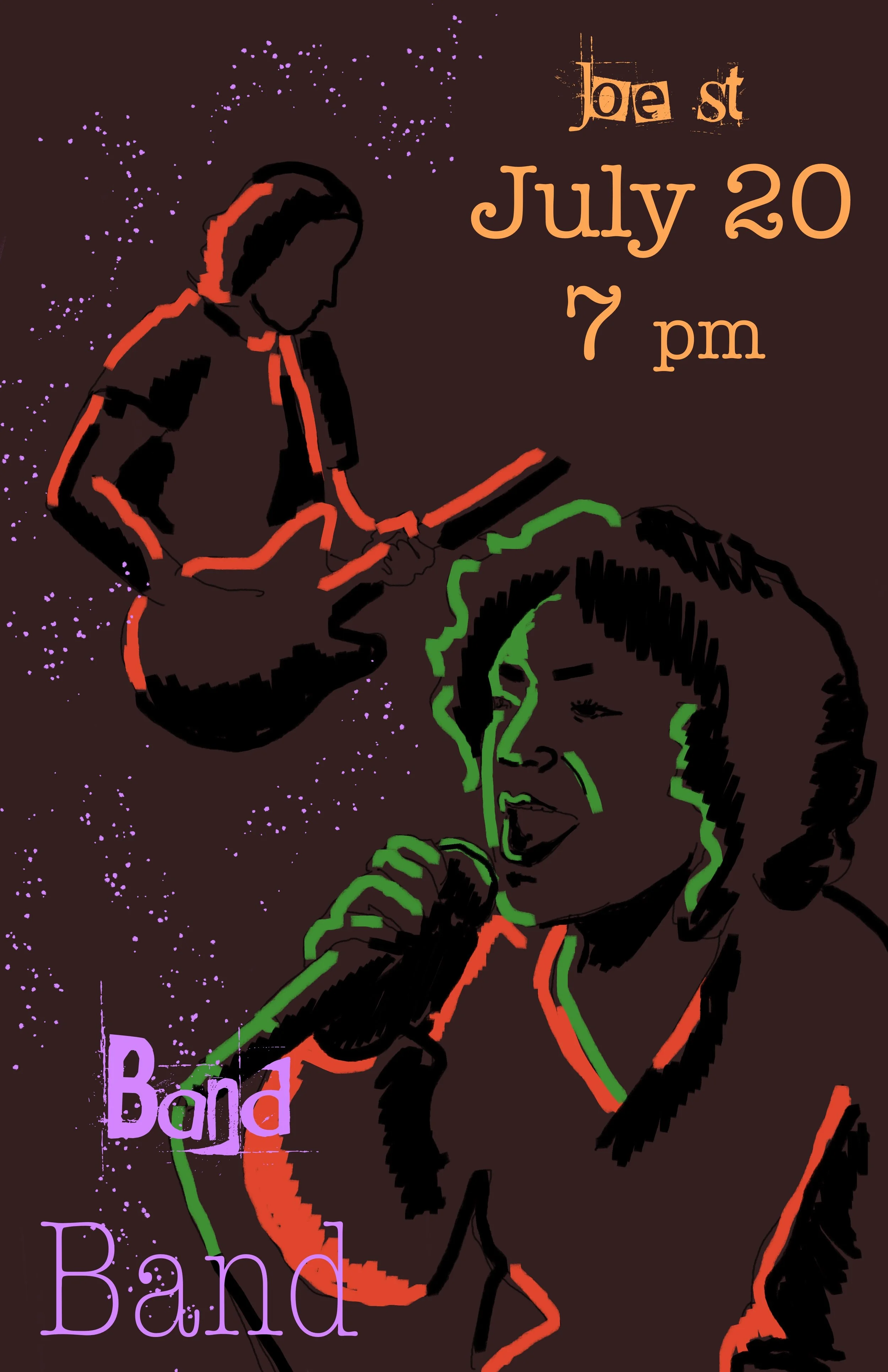
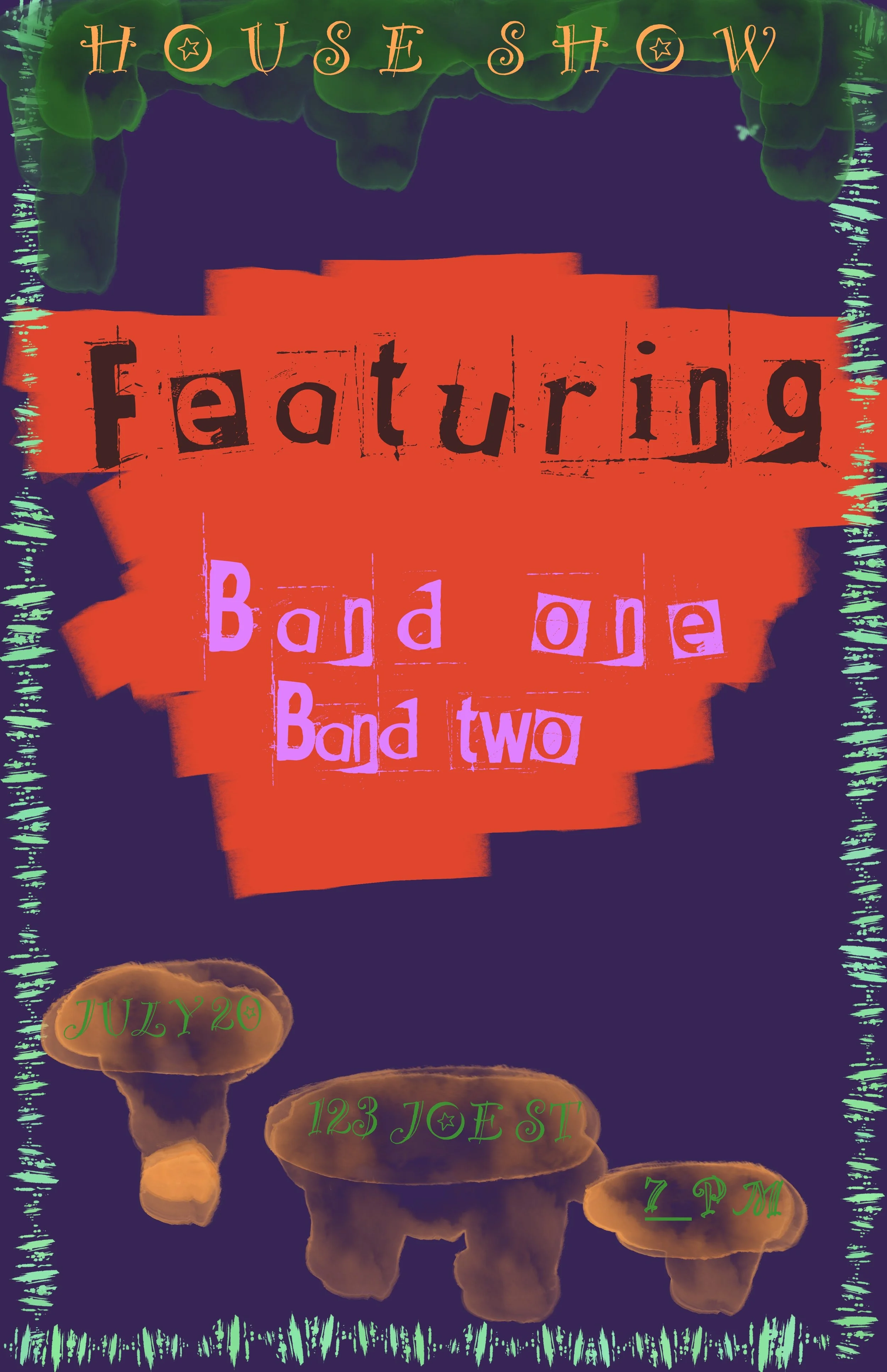
Posters
These posters were designed based on a punk/rock house show. The color palette is meant to be grungy and reflect a young, energetic audience. The font choices are meant to give the impression of a homemade and locally distributed poster.
Animation
This is a simple animation I created using procreate, of me blowing on my coffee. I usually use Earth tones or richer colors, so I decided to try a more vibrant palette.